Topic: [Capes] New cover, early draft for critique
Started by: TonyLB
Started on: 5/11/2005
Board: Publishing
On 5/11/2005 at 3:06pm, TonyLB wrote:
[Capes] New cover, early draft for critique
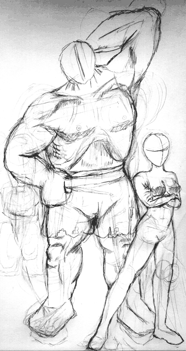
Last time through, people had very solid comments on my cover, but I got them too late into the process to take advantage without throwing away a lot of work. I don't want to repeat that mistake, now that I'm doing a better cover for upcoming editions.
So I've got the first sketch draft of the art for the front. I'm hoping to get across some of the way that Capes encourages conflict on a personal level as well as a super-powered level, particularly by having the much less imposing physical specimen clearly be completely dominant in the interpersonal dynamic being shown.
So what do you think? Does that come across? Are the proportions closer to comic-booky than the previous cover? Any glaring errors? Anything you particularly like?
Forge Reference Links:
Topic 13666
On 5/11/2005 at 3:25pm, Bret Gillan wrote:
RE: [Capes] New cover, early draft for critique
I like the big hulking dude and the poses. I'd have to wait to see the facial expressions to see if the message really comes across, but so far, so good.
I gotta say that their costumes aren't very superhero-y, but I like it.
On 5/11/2005 at 3:28pm, Jasper Polane wrote:
RE: [Capes] New cover, early draft for critique
Hi Tony,
The woman's legs appear to have different sizes. Her right leg (left to us) would be correct, the other leg seems a little short to me.
--Jasper
On 5/11/2005 at 3:48pm, TonyLB wrote:
RE: [Capes] New cover, early draft for critique
Haven't done the woman's costume yet... the big guy is going Hulk-Chic, though I may add some chains or something to emphasize the "I'm a raging beast of fury" motif.
Jasper: Good catch on the legs. The left hip is supposed to be raised (since that leg is weight-bearing)... a little fiddle to where the iliac crest merges into the rest of the body should make the difference. Thanks!
On 5/11/2005 at 4:09pm, Brendan wrote:
RE: [Capes] New cover, early draft for critique
This may be too late if you're set on that particular setup, but I look at that and go "I want them to be doing something."
On 5/11/2005 at 4:15pm, Andrew Morris wrote:
RE: [Capes] New cover, early draft for critique
Another thought -- the genders might lead the viewer to read that as the message, rather than the weak/strong split. It's funny, but when I was thinking about what kind of image would convey Capes, I had pictured something much like this. I was seeing more active scolding from the little character, though -- shaking a finger or something.
What's going to be in the background?
Brendan wrote: "I want them to be doing something."
Yeah, same here
On 5/11/2005 at 4:20pm, TonyLB wrote:
RE: [Capes] New cover, early draft for critique
I tried about... err... twenty different takes on the scolding thing. I liked that idea too.
The problem with it is facing, relative to the point of view. You can do scolding real easy in two panels, with different front-facing pictures on each of the people. One panel? Somebody's got their back turned toward the viewer. Yeah, yeah, I know... three-quarter profiles and distorted lenses, and... I couldn't make it work. Some artists, no doubt, can. I couldn't.
How's this for doing something, mostly in the yet-undefined faces? Big bruiser is either rubbing his neck in confusion or slicking his hair in an attempt to be more presentable (the latter if I can convey it... it's just so plaintive). The girl is looking away and egregiously rolling her eyes in amused contempt.
On 5/11/2005 at 4:55pm, timfire wrote:
RE: [Capes] New cover, early draft for critique
TonyLB wrote: You can do scolding real easy in two panels, with different front-facing pictures on each of the people.
What's wrong with splitting the cover into multiple panels? I think it would add to the color.
On 5/11/2005 at 5:03pm, inthisstyle wrote:
RE: [Capes] New cover, early draft for critique
timfire wrote:TonyLB wrote: You can do scolding real easy in two panels, with different front-facing pictures on each of the people.
What's wrong with splitting the cover into multiple panels? I think it would add to the color.
Yeah, good idea. I liked the With Great Power... cover that had panels, even though it was the same picture in each one. You could have two smaller close-ups, one with bruiser yelling, then the woman scolding, and then the woman's turnaway from the bemused bruiser in a final big splash panel.
On 5/11/2005 at 5:20pm, TonyLB wrote:
RE: [Capes] New cover, early draft for critique
My gut reaction to this is negative. Which is just by way of informing you guys. I'm not exactly sure why, but I see two possibilities.
First, unlike WGP, Capes is not about the comic book medium. I've stayed away from panels as a metaphor, and I'm pretty happy with that decision.
Second, I actually like the notion that people don't know what's happening in the shot. It gives them some room to project their own thoughts onto the picture. I think some added emotional subtext (on the faces) will help that.
Anyway, thanks for the recommendations! I'll try a panel layout (because I'm trying all sorts of things) and see what I can do with it.
On 5/11/2005 at 5:30pm, matthijs wrote:
RE: [Capes] New cover, early draft for critique
Hulk is really hot for that chick, right? But she doesn't get it? Poor sad bastard. Still, you know, it might work out if... uh, I'm reading too much into this...
Just for fun, picture these gender combinations in your head instead and see what relationships you assume:
Big woman, small man
Big man, small man
Big woman, small woman
On 5/11/2005 at 5:40pm, inthisstyle wrote:
RE: [Capes] New cover, early draft for critique
Flash of inspiration: this would really work if there was a giant robot or spaceship destroying the city in the background, while the two foreground characters have some sort of argument about their relationship. Just an idea, and definitely accurate to Capes play.
On 5/11/2005 at 5:48pm, TonyLB wrote:
RE: [Capes] New cover, early draft for critique
Oh, that's sick. I don't know if I'm good enough to do that and have it read clearly to the eye, but I certainly like the idea.
On 5/11/2005 at 5:51pm, Andrew Morris wrote:
RE: [Capes] New cover, early draft for critique
You could also do one with the big, hulk-type blushing and handing a rose to the female super, while mayhem rages in the background.
On 5/11/2005 at 5:53pm, Valamir wrote:
RE: [Capes] New cover, early draft for critique
In terms of making it easily readable to the eye:
I think if the back ground had some low detail sky scrapers getting blasted to rubble by blaster rays from flying saucers (more the suggestion of than any real detail)...
...while the foreground had hulk-dude like now, scratching his head and his face looking puzzled...
...and the chick actually turned away from him to our right with one arm out in the "talk to the hand" pose
That that would be pretty instantly recognizeable.
On 5/11/2005 at 6:03pm, TonyLB wrote:
RE: [Capes] New cover, early draft for critique
Hrm... maybe have the city-destruction in a vertical strip of background (top to bottom, bleeding all the way past the trim-edge of the cover) but have both of the foreground characters actually breaking past that strip into white unbackgrounded space on the left and right.
I think that visually makes them in the scene, but not of it, and also gives the viewing eye instant places to start parsing them as figures.
On 5/11/2005 at 7:43pm, Valamir wrote:
RE: [Capes] New cover, early draft for critique
Hey, I like that. Very stylish. And would allow a greater degree of detail in the city scene without distracting from the forground.
I'm envisioning laying it out like two seperate overlapping pictures. The rear one being the city scene the other one being shifted down and to the right containing the characters, but then have no border where they overlap so they visually run together.
I think that would look slick.
On 5/11/2005 at 10:50pm, paulkdad wrote:
RE: [Capes] New cover, early draft for critique
I like the interaction, but would like to see more action with more figures (not talking about the background at all here). I'll try to describe it with words, starting with the hulking brute:
The hulking brute (seen about 3/4 frontal, turned towards the right edge of the panel) is leaning forward, hunched over (trying to talk with the woman eye-to-eye), with a questioning/pleading (not to be interpreted as "begging") look on his face. His elbows are at about waist level, forearms forward and slightly out to each side, palms up, hands tense (possibly clenched).
Another figure is partially behind the brute and to his right (in the panel), attempting unsuccessfully to hold him back. He is straining so hard that his eyes are squeezed shut, but to no avail.
The woman in the foreground (seen about 2/3 frontal, but turned towards the left edge of the panel) is in the classic "talk to the hand" position, with her right arm extended towards the brute. Her face shows her stubborn determination to have her way.
In the back (to the left of the brute in the panel) is a figure seen in profile (pointed inwards), looking back towards whatever is happening in the background and scratching his head in confusion.
On 5/12/2005 at 5:42am, Jasper Polane wrote:
RE: [Capes] New cover, early draft for critique
The "Talk to the hand pose" always looks fake to me. Do people actually do that?
Maybe the girl should be turned away from him more, in a "I'm ignoring you" sort of way.
--Jasper
On 5/12/2005 at 5:49am, Jasper Polane wrote:
RE: [Capes] New cover, early draft for critique
This is what I mean: http://home.planet.nl/~loije022/images/temp/girlsketch.jpg
--Jasper
On 5/12/2005 at 8:52am, Jack Aidley wrote:
RE: [Capes] New cover, early draft for critique
I like the poses depicted in your sketch; they convey a relationship but are ambiguous about it. The talk-to-the-hand pose would be more in your face and definite. It's that subtle ambiguity that lends the positioning it's power.
And the destruction in the background thing? I likey.
On 5/12/2005 at 12:28pm, TonyLB wrote:
RE: [Capes] New cover, early draft for critique
Jasper, I love the body turned away, but eyes glaring back thing. It wonderfully conveys "I need to make absolutely sure that you can't miss the fact that I'm ignoring you completely." I'll definitely have to experiment with that: I was thinking a disgusted eye-roll, but that may not convey as well.
On 5/12/2005 at 12:44pm, paulkdad wrote:
RE: [Capes] New cover, early draft for critique
The "Talk to the hand pose" always looks fake to me. Do people actually do that?
Oh yeah, they do it.
For me, the issue is that "four color" comics emphasize dynamic compositions (especially on the cover), while the whole "I'm confused/I'm ignoring you" situation is static. There are no lines of force directing one character's energy towards another. So, while it does convey relationship it doesn't convey competition.
To make the composition more dynamic, I'd suggest directing the Brute's energy towards the woman in the foreground. The addition of another character (male, to show that it isn't a gender dynamic) struggling against him in vain emphasizes the raw power of the conflict. She, on the other hand, is able to stop him with an upturned hand. The hand is necessary to stop his energy. If she just stands like a statue the dynamic tension is halved. The confused character I suggested is not a part of this struggle. In fact, if you're doing a wraparound with the background, she could even be moved to the back (so she doesn't draw attention away from the conflict).
If these figures are basically characters standing in for players who are fighting over control of the action, then that's a pretty dynamic situation. What you're showing with the "I'm confused/I'm ignoring you" situation is the aftermath, not the conflict.